
I have been studying some of the images posted over at Flickr that have been beautifully photoshopped, so I decided - since someone gave me a wacom tablet and photoshop elements a couple years, or so, ago, - that I should try to learn how to use it.
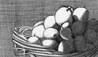
The image on top is the original apple basket that I drew from a reference photo I took last summer. The b/w image provides a nice set of values that allows the light hitting the apples to almost jump off the page. I think if the background were darkened it would work even better.
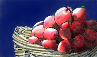
The bottom image shows a bit more refinement of technique on the apples and the shadows behind them. I think I like this one best; still there is plenty of room for improvement.
The black and white drawing has drawn a more comments (here and over in Flickr in earlier postings). I agree, the black and white is a more appealing image that the photoshopped one.
What do you think?
Your fourth attempt is fine.
ReplyDeleteIt's very different from your usual work but it's fine too.
I like your blog, your drawings are very vivid(I'm not sure about this word..)
I skimmed though all your pics on this first page and you're really good...I know you see "tight" but I think they're really good!! It may not seem great to get feedback from someone who entirely new to drawing but with my fresh non-discriminating eyes, this stuff looks pro...like you could illustrate stuff! Just my 2 cents ;P
ReplyDeleteKelly edm
I like both. I too am self-learning Photoshop. If I ever take a class I'll probably have more to unlearn than anything else. HA. I also get lots of comments on my b/w images. I think people are so saturated with hype and color and realism that the simplicity of pen & ink shocks them into making remarks.
ReplyDeleteOnce I started using lots of layers and different opacities (not to mention varied tones) I got more contrast in photoshop.
I'll be back!
I once read a tip for coloring drawings in photoshop that said you should first fill the picture in with a neutral color, instead of starting from white. I like the colorful ones but I still like the black and white version best. Maybe it was just meant to be b/w. I think it's those bright whites on the apples that look so good.
ReplyDeleteI think you have done a wonderful job in Photoshopping this. You have retained the way the light falls. Using the tiny bits of green, as the complement of the red, makes the red pop.
ReplyDeleteJim--
ReplyDeleteNice post. Photoshop is lots of fun. I know about 20% of all there is to know about the application. Sounds like you are having fun playing.
Hello Fair Artist of such very pretty apples,
ReplyDeleteWe have been watching you. We are artist also. At least that's what they call us. You may even know us.
We'd like to invite you to a member of our very Private Club. We're very selective and only an elite few are welcome on our hallowed grounds. We pick you.
We even have a little 'chit chat' room just for the likes of you. It's rightfully called Dante's Pub. But when your enter BEWARE! You are entering the abyss of the artist mind! You may not find your way out.
You're welcome to watch from afar while drinking your brew or pull up a chair and joiin us for a little chat. Be sure and register and then log in. After all, this is a very private club. We don't allow just any wanderer in our midst.
Don't dilly dally now! It wont cost you a pence. Check out The Artist Challenge and Dante's Pub- that is if your daring and think yourself worthy to be amongst the souls we've claimed?
Farewell...until we hear from you,
Master Mike and the Pub Wench
Artist Challenge- http://www.theartistchallenge.com/
Dante‘s Pub - http://www.theartistchallenge.com/art-forum/